

To clarify, what you can accomplish with a flex box or its power is shown below.
.container{
    display: flex;
    justify-content: center;
    align-items: center;
}
The ability to centre the div with only three easy lines of CSS is a lifesaver.
So you're probably wondering what flex, justify-content, and align-items are. Don't worry, you'll understand it after just a few minutes of reading the article below.
If you want to code alongside me, Download the HTML and CSS files by clicking here.
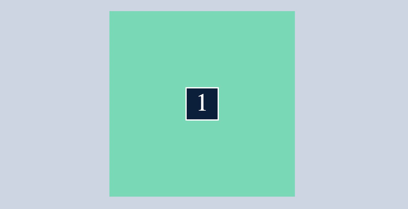
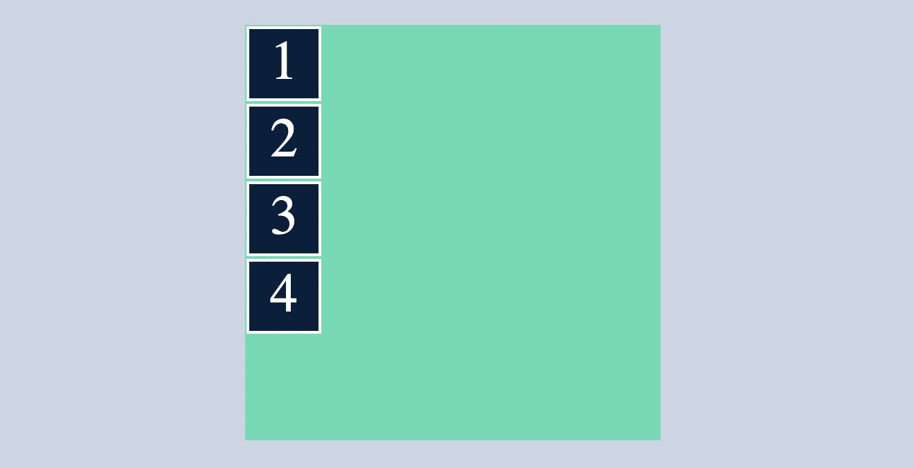
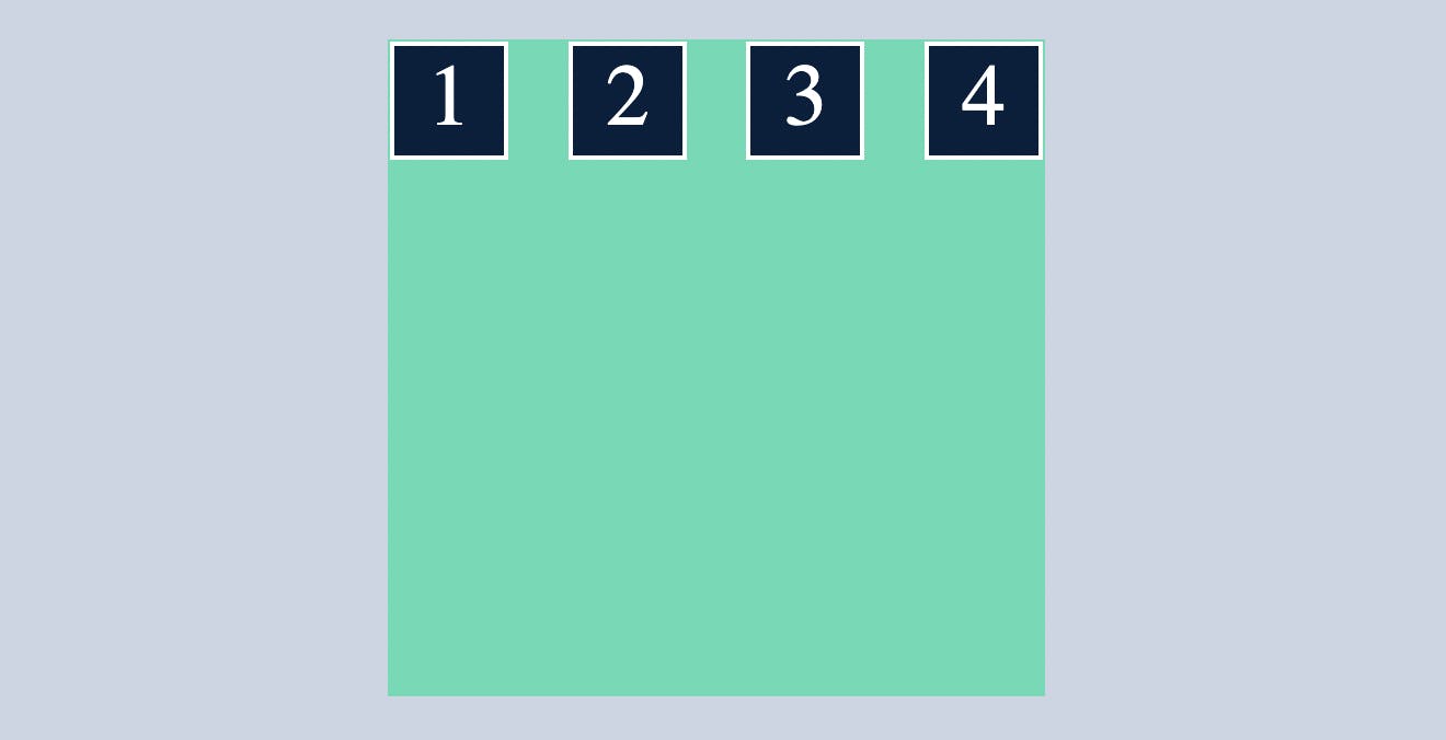
We shall go line by line. In the following example, I will use a container(class) with a defined height and width and 5 child divs.
Before applying display:flex
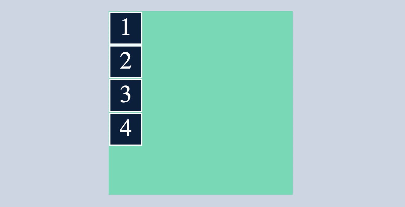
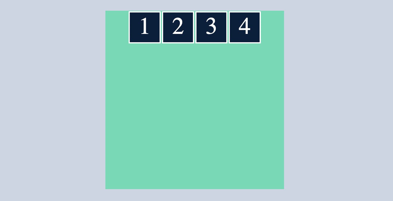
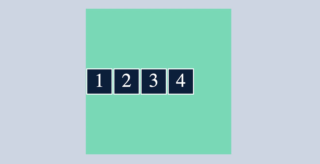
After applying display:flex
.container{
  display: flex;
}
After applying display: flex , all div’s inside this container class will align main axis which is by default, left to right or vertical
What is flex-direction, main-axis, cross-axis?
by default
flex-direction:row
This means the main axis is left to right(Horizontal) and cross axis is top to bottom(Vertical)
when you change
flex-direction:column
This means the main axis is top to bottom(Vertical) and cross axis is left to right(Horizontal)
Note: understanding which is main axis and cross axis is important
.container{
  display: flex;
  flex-direction: column;
}
justify-content
justify-content indicates where the container's div's should be placed within a container.
or
controls where the flex items sit on the main axis.
center
Puts flex items in the center of the main axis
.container{
  display: flex;
  flex-direction: row;
  justify-content: center;
}
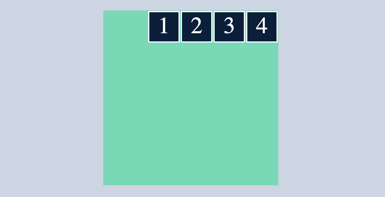
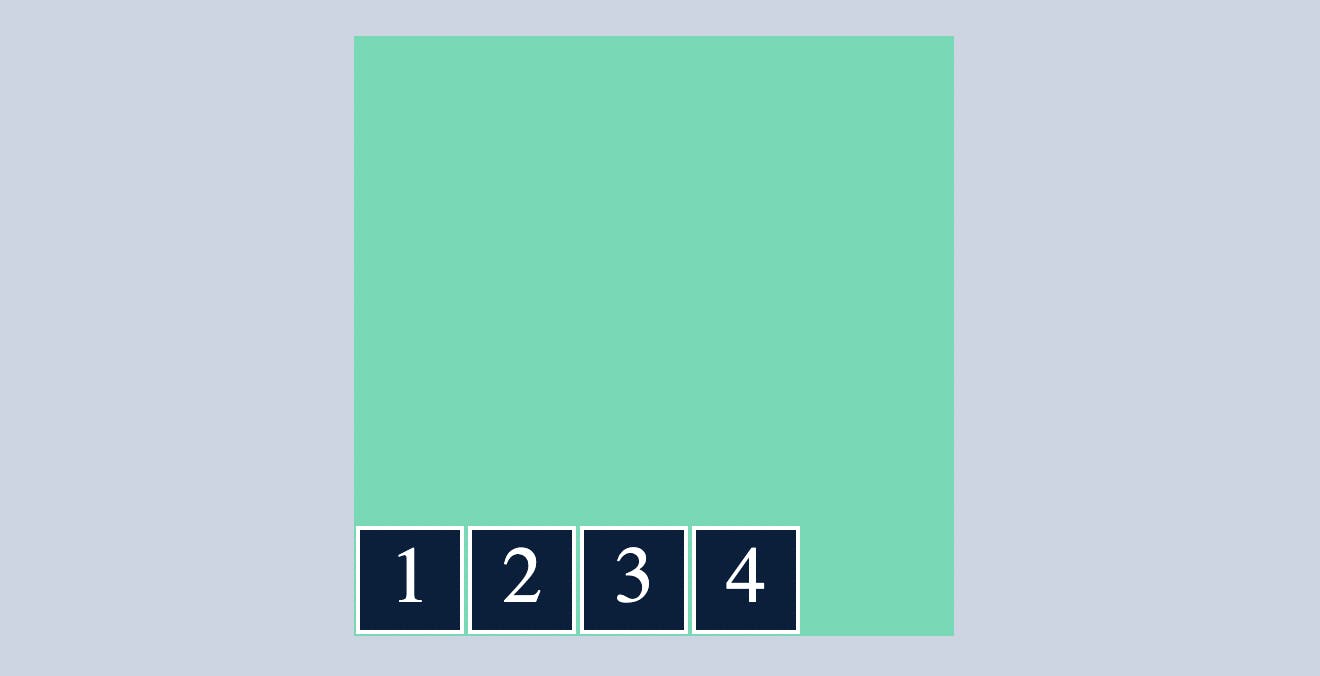
flex-start
which makes all the flex items sit at the start of the main axis.
.container{
  display: flex;
  flex-direction: row;
  justify-content: flex-start;
}

flex-end
which makes all the flex items sit at the end of the main axis.
.container{
  display: flex;
  flex-direction: row;
  justify-content: flex-end;
}
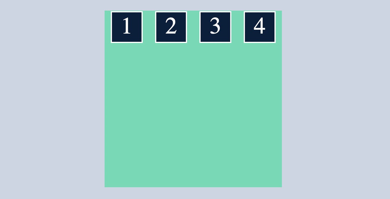
space-around
distributes all the flex items evenly along the main axis with a bit of space left at both end.
.container{
  display: flex;
  flex-direction: row;
  justify-content:space-around;
}
space-between
distributes all the flex items evenly along the main axis without space left at both end.
.container{
  display: flex;
  flex-direction: row;
  justify-content:space-between;
}
TRY: change the
flex-direction:columnand use the above snippet of justify-content and note the difference.
align-items
align-items indicates where the container's div's should be placed within a container along cross axis.
or
controls where the flex items sit on the cross axis.
center
Puts flex items in the center of the cross axis
.container{
  display: flex;
  flex-direction: row;
  align-items: center;
}
flex-start
which makes all the flex items sit at the start of the cross axis.
.container{
  display: flex;
  flex-direction: row;
  align-items: flex-start;
}

flex-end
which makes all the flex items sit at the end of the cross axis.
.container{
  display: flex;
  flex-direction: row;
  align-items: flex-end;
}
baseline
note here I removed the defined height and width of child div's and decreased and increased the font size of 2nd and 4th child div's respectively.
.container{
  display: flex;
  flex-direction: row;
  align-items:baseline;
}
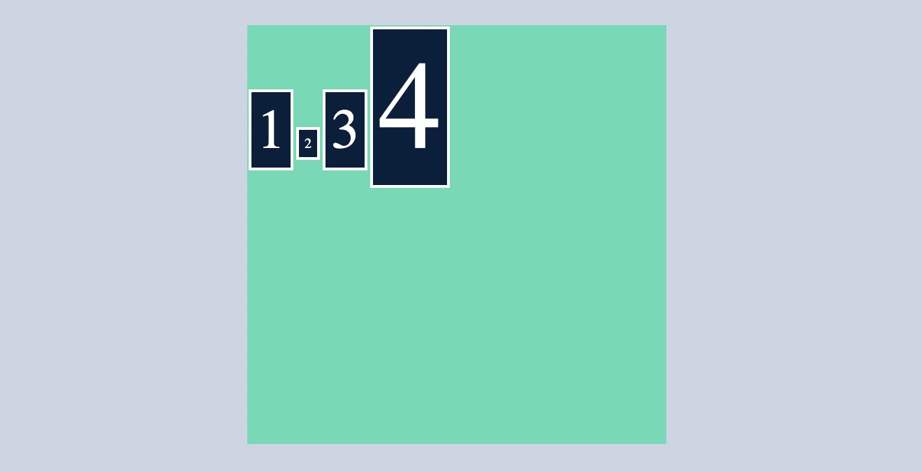
here you can see despite being different font size all the items are aligned in a single line.

I guess you got it by now
stretch
by default stretch is applied to the container div's when you display it as flex
.container{
  display: flex;
  flex-direction: row;
  align-items:stretch;
}
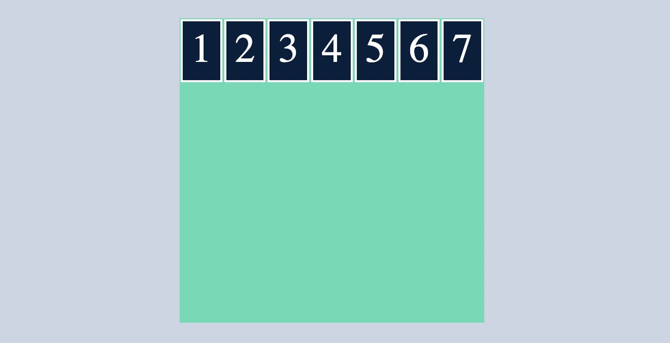
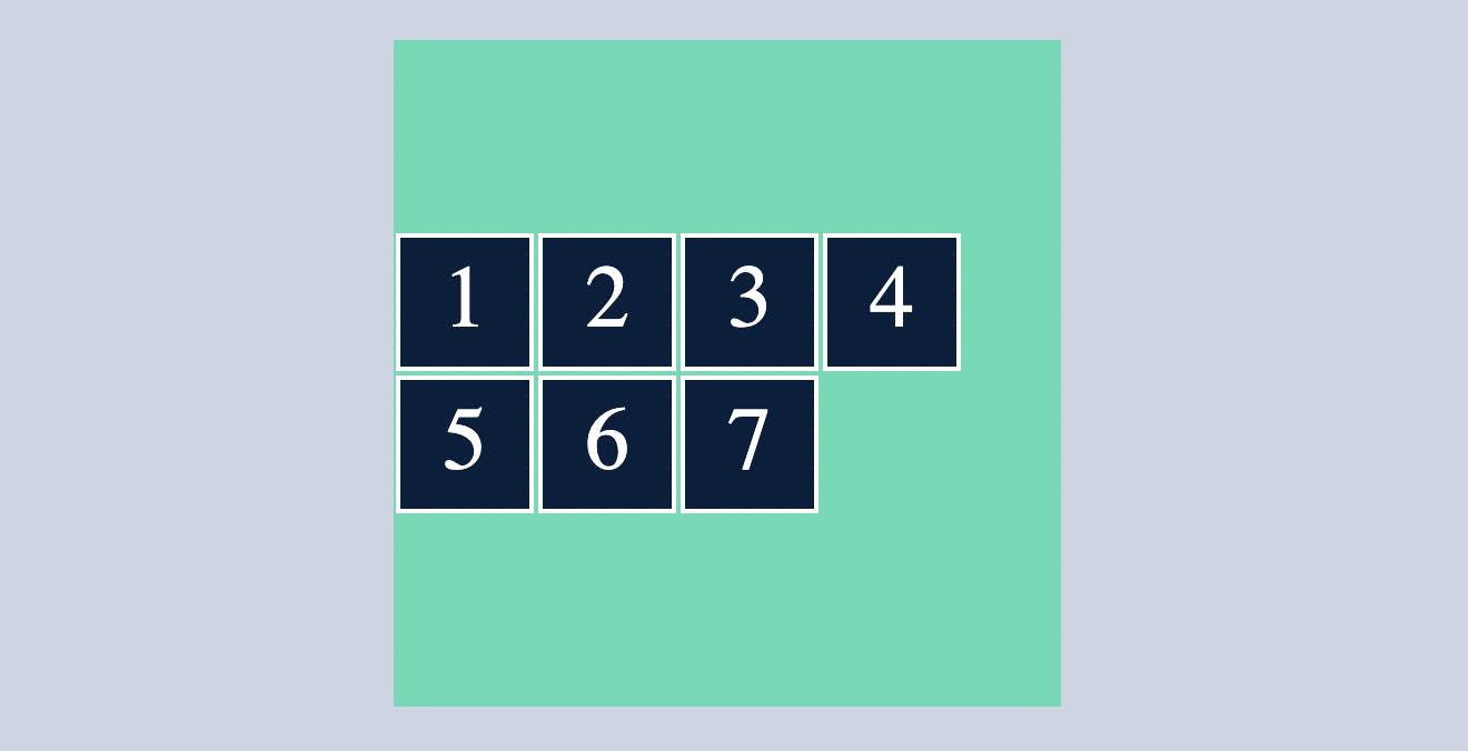
flex-wrap
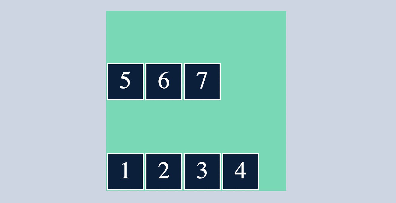
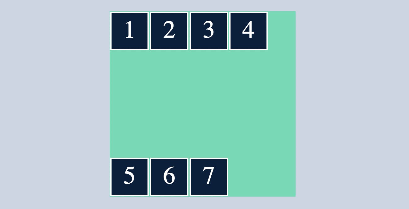
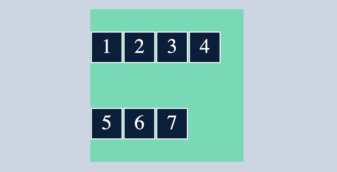
To understand flex wrap we need to add some more cild cards or flex items(7)
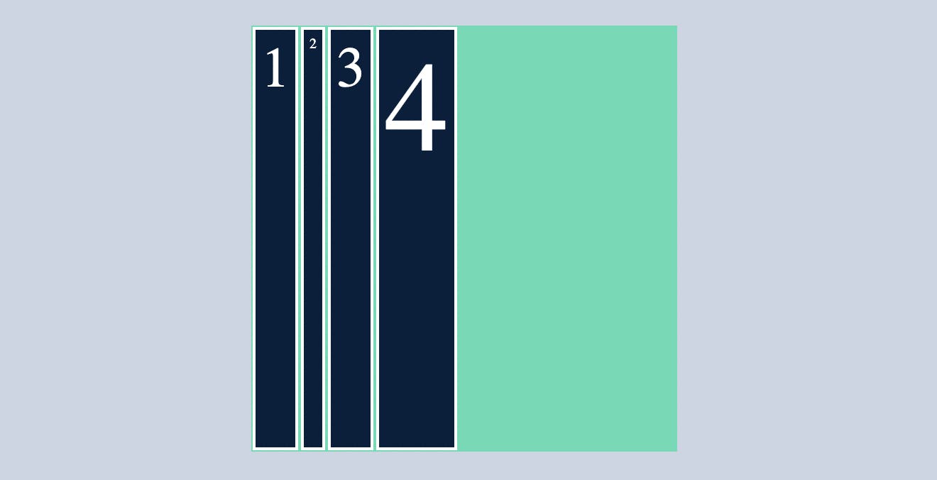
without using flex-wrap, flex items either adjust in a single row by reducing the width of the flex item like below
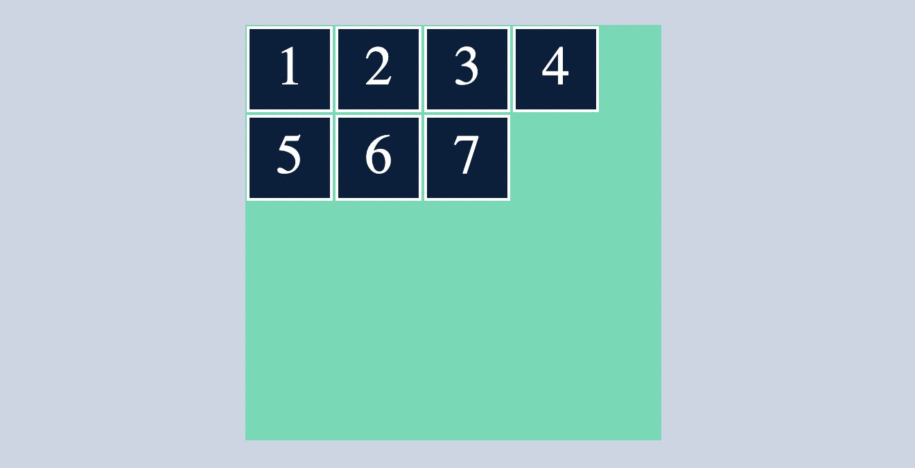
OR it will overflow the container
like below
In this type of condition we make use of flex-wrap, where the flex-items will wrap themselves
by default flex-wrap in all above cases is no-wrap
wrap
flex-wrap:wrap will just wrap the flex-items that's it, if you did't got that check the below example
.container{
  display: flex;
  flex-direction: row;
  flex-wrap: wrap;
}
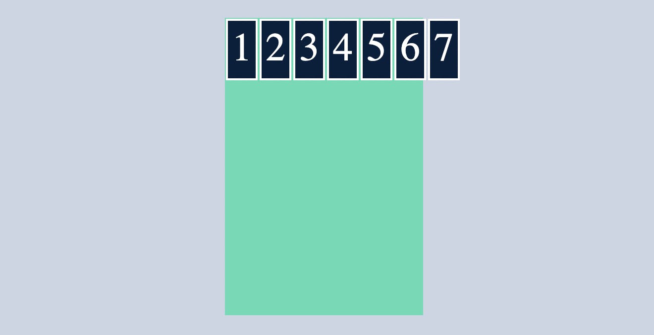
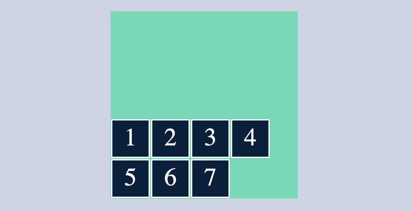
wrap-reverse
flex-wrap:wrap-reverse will wrap the items in reverse order
.container{
  display: flex;
  flex-direction: row;
  flex-wrap:wrap-reverse;
}
align-content
When you want to align content in horizontal/vertical you can align them using align-items/justify-content
However, we can't control elements that wrap around different rows/columns with justify-content or align-items.In this case we make use of align-content
by default align-content:stretch;
stretch
align-content:stretch; will gave equal space between rows/columns
.container{
  display: flex;
  flex-direction: row;
  flex-wrap:wrap;
  align-content:stretch ;
}

center
align-content:center will make sure the flex items to be in centre as you can see below
.container{
  display: flex;
  flex-direction: row;
  flex-wrap:wrap;
  align-content:center ;
}
flex-start
align-content:flex-start will arrange the row's/column's in the starting of the flex
.container{
  display: flex;
  flex-direction: row;
  flex-wrap:wrap;
  align-content:flex-start ;
}
flex-end
align-content:flex-end will arrange the row's/column's in the ending of the flex
.container{
  display: flex;
  flex-direction: row;
  flex-wrap:wrap;
  align-content:flex-end;
}
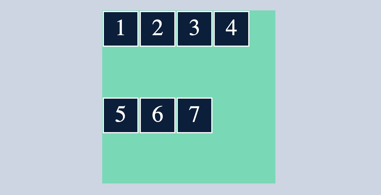
space-between
align-content:space-between ; will arrange the row's/column's in such a way that it will have equal amount of space between them with no space between the container
.container{
  display: flex;
  flex-direction: row;
  flex-wrap:wrap;
  align-content:space-between ;
}
space-around
align-content:space-between ; will arrange the row's/column's in such a way that it will have equal amount of space between them and also some space with the container.
Flexbox has many properties, however in this article, I covered the most basic and commonly used flexbox properties. If you want to learn more about flexbox, click on the link below.
If you want to practice flex box in a more fun way check out this game Flexbox Froggy
Thank you for sticking with me until the end.